Elara Rebrand: How Research Played the Biggest Role
Every great brand begins long before a single logo is sketched. It starts with listening to the client, to their audience, and to the deeper story the brand is trying to tell. Our work with Elara is a perfect example of what happens when research and design work in complete harmony.
Why we always start with research
Before we touched a typeface or colour swatch, we spent time understanding what Elara truly needed to communicate. The brand serves a community that empowers women and marginalised genders to learn, collaborate, and take inspired action. That's not a brief you can fake your way through with a generic logo it demands intention at every level.
Our research phase surfaced a constellation of keywords that would go on to shape every single design decision.
These aren't just nice words they became our design brief. Each visual choice had to earn its place by reflecting at least one of them.
“These aren't just nice words they became our design brief. Each visual choice had to earn its place by reflecting at least one of them.”
The name behind the brand
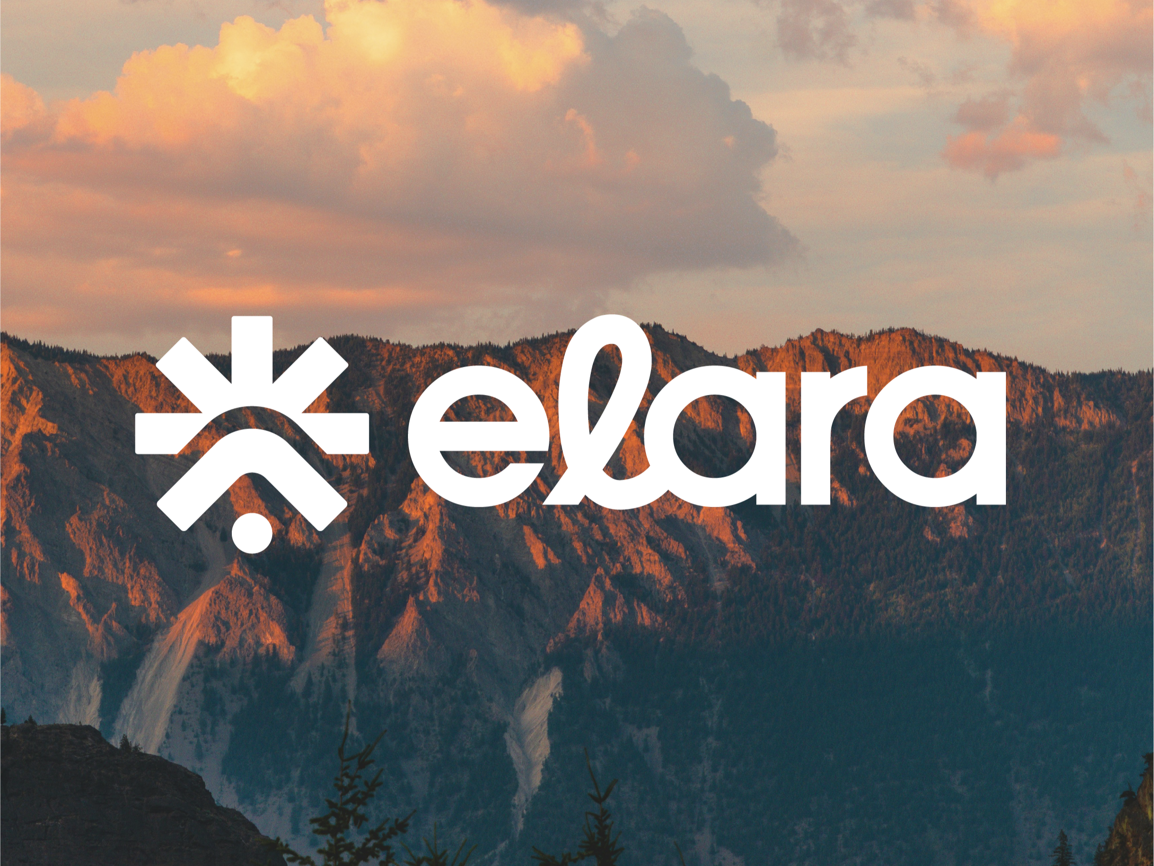
We also dug into the name itself. Elara is of Greek origin associated with a mortal princess in Greek mythology and one of Jupiter's moons, carrying meanings of light, brightness, and celestial beauty. That layered symbolism was too good to ignore. It gave us permission to reach for something cosmic: a brand that felt both deeply human and quietly extraordinary.
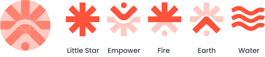
Icons that mean something
The icon suite was built around a central submark that represents the whole brand in a single mark — a circle containing elements of fire, water, earth, and the human form. Each icon in the suite was designed to stand alone while reinforcing the bigger picture:
The asterisk the "little star" connected directly to the name Elara and to the Ancient Greek word asteriskos. Rather than a decorative afterthought, it became a meaningful throughline: every use of the asterisk in Elara's communications subtly echoes the brand's celestial roots and its belief in lighting the way for others.
What this means for your brand
If you're currently using a logo you built in Canva (no shame, we've all been there), consider what your brand might look like if every element had a reason to exist. When research drives design, the result isn't just beautiful it's coherent, credible, and deeply ownable.
Elara's brand doesn't just look good. It means something. And that's the difference between a logo and an identity.